· Nas · Technology · 10 min read
How to Build a Website/Landing Page for Free with v0 - Step by Step Guide
Complete step-by-step tutorial on using Vercel's v0 to create professional, conversion-optimized landing pages in minutes, absolutely free.

How to Build a Professional Website/Landing Page for Free with v0 - Complete Guide
Building a website used to mean either spending thousands on developers or spending weeks learning to code. Product launches got delayed, marketing campaigns stalled, and great ideas died waiting for websites.
That’s why v0 by Vercel is a complete game-changer. This AI-powered design tool lets you create professional, responsive landing pages in minutes just by describing what you want in plain English.
In this guide, I’ll walk you through the exact step-by-step process to go from zero to a published landing page in under an hour, completely free.
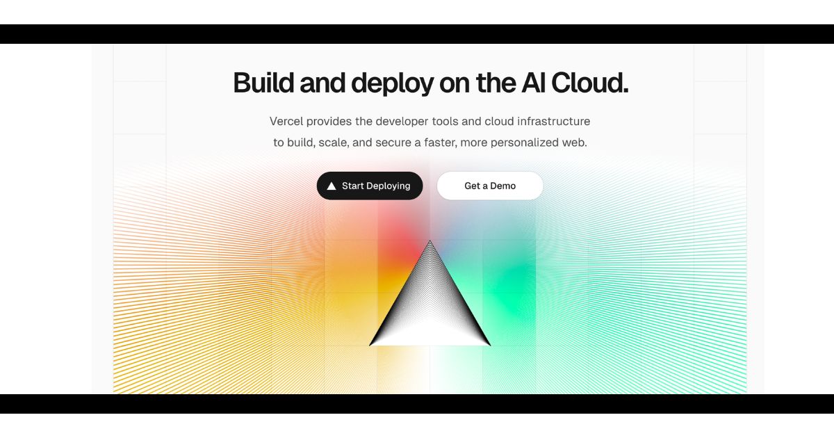
Step 1: Sign Up for v0 (It’s Free!)
Get Started Without a Credit Card
Head to v0.dev and sign up with your Google, GitHub, or email account. The free tier gives you:
- 7 credits per day (enough to generate multiple landing pages per month)
- Full access to all AI design features
- Ability to export code for any website
- No credit card required
Pro tip: Each generation and iteration uses approximately 1 “credit”, so you can prompt the system 7 times per day on the free plan.
Once you’re signed in, you’ll see a clean interface with a prompt box. This is where the magic happens.
Step 2: Write the Perfect Prompt (With Copyable Examples!)
The Secret to Getting Exactly What You Want
The quality of your landing page depends entirely on how well you describe it. v0 works best with detailed, specific prompts that include:
- Purpose: What is this page for?
- Target audience: Who is it for?
- Key sections: What content do you need?
- Style/vibe: What should it look and feel like?
- Call-to-action: What action should visitors take?
Example Prompts You Can Copy & Customize:
For a SaaS Product:
Create a modern landing page for a project management tool for remote teams. Include a hero section with headline "Manage Projects Without the Chaos", 3 feature cards highlighting collaboration, time tracking, and reporting, a pricing section with 3 tiers, customer testimonials, and a demo request form. Use a clean, professional design with blue and white colors. Make the CTA button "Start Free Trial" prominent and green.For an E-commerce Brand:
Build a landing page for a sustainable clothing brand targeting millennials. Include a hero section with a large product image, "About Our Mission" section emphasizing eco-friendly materials, a featured products gallery with 6 items, customer reviews with 5-star ratings, and an email signup for 10% off. Use earthy tones (green, beige, brown) with a minimalist, modern aesthetic.For a Service Business:
Design a landing page for a freelance web design service. Hero section with headline "Beautiful Websites That Convert", portfolio gallery showing 6 previous projects, services offered (web design, branding, SEO), pricing packages with clear comparisons, client testimonials, and a contact form. Style should be creative but professional, using purple and black colors.For a Lead Magnet:
Create a landing page to offer a free "Instagram Growth Guide" PDF download. Include a compelling headline about growing followers organically, 5 bullet points of what's inside the guide, social proof showing download count, a preview image of the guide cover, email capture form with just name and email fields. Use Instagram's color scheme (pink, purple, orange gradient) with modern, energetic design.Key takeaway: The more specific you are, the better your results. Don’t just say “make a landing page” - describe sections, colors, emotions, and exact CTAs you want.
Step 3: Review and Refine Your Design
Iterate Until It’s Perfect
After submitting your prompt, v0 will generate your landing page in about 10-30 seconds. You’ll see:
- A live preview of your entire page
- The ability to scroll through and see all sections
- An edit prompt box to make changes
If something isn’t quite right, use simple refinement prompts like:
- “Make the hero section background image darker”
- “Change the CTA button to orange”
- “Add more spacing between sections”
- “Make the headline bigger and bolder”
- “Add a newsletter signup section at the bottom”
Each refinement uses an additional “question credit”, but it’s normal to iterate 3-4 times to get it perfect while staying within your free monthly limit.
Step 4: Ensure Mobile Optimization (This is Critical!)
Why Mobile Matters More Than You Think
Here’s a stat that should scare you: over 60% of web traffic comes from mobile devices. If your landing page looks broken on phones, you’re losing more than half your potential customers.
The good news? v0 automatically creates responsive designs. But you MUST check them yourself, as a lot of the times, the design will either not be optimized for mobile.
How to Check Mobile Optimization in v0:
- Look for the device toggle icons (desktop, tablet, mobile) above your preview
- Click through each device size to see how it adapts
- Check that:
- Text is readable without zooming
- Buttons are large enough to tap (minimum 44x44 pixels)
- Images resize properly without distortion
- Forms are easy to fill out on mobile
- Navigation menus collapse into hamburger menus
Common Mobile Issues to Fix:
- Text too small: Add to your prompt: “Increase font sizes for mobile devices”
- Buttons too close together: Specify: “Add more padding between buttons on mobile”
- Images overflowing: Request: “Make all images responsive and fit within screen width”
Pro tip: Test on your actual phone too! Open the preview link on your mobile device to see the real user experience. What looks good in desktop preview might feel different in your hand.
Need help building your landing page?
Get in Touch Today →Step 5: Optimize for Conversions (Make Every Visitor Count!)
A Beautiful Page That Doesn’t Convert is Worthless
Your landing page has ONE job: get visitors to take action. Whether that’s signing up, buying, or booking a call - everything should guide them toward that goal. Once you have a landing page, use Talk to me Data to know where your website excels, and how it can be improved from a conversion perspective.
Critical Conversion Elements to Include:
1. Clear Value Proposition (Above the Fold) Your headline should answer: “What is this and why should I care?” within 3 seconds. Bad example: “Welcome to Our Platform.” Good example: “Cut Your Project Management Time in Half.”
2. Single, Focused Call-to-Action Don’t confuse visitors with multiple CTAs. Pick ONE primary action:
- “Start Free Trial”
- “Download Free Guide”
- “Book a Demo”
- “Get 10% Off”
Make this button:
- Contrasting color (stands out from background)
- Large enough (minimum 48px height)
- Action-oriented language (“Get Started” not “Submit”)
- Repeated 2-3 times throughout the page
3. Social Proof That Builds Trust Add one or more of these:
- Customer testimonials with photos and names
- Number of users/downloads/customers
- Logos of companies you’ve worked with
- Star ratings and review counts
- “As featured in” media logos
4. Benefit-Focused Copy Don’t list features - explain benefits. Instead of “Cloud-based storage,” say “Access your files from anywhere, never lose work again.”
5. Urgency or Scarcity (When Authentic) If applicable:
- “Limited spots available”
- “Offer ends in 3 days”
- “Only 47 left in stock”
- “Join 1,000+ people already enrolled”
How to Add These in v0:
Update your prompt with specific conversion elements:
Add a testimonials section with 3 customer quotes, each showing a photo, name, and company. Include a trust banner showing "10,000+ users" and company logos (Shopify, Amazon, Google). Make the CTA button say "Start Free Trial Today" in bright green and place it in the hero section and again after testimonials. Add a FAQ section at the bottom with 5 common questions.Important: Conversion optimization is MORE important than pretty design. A simple, clear page that converts at 8% beats a beautiful page that converts at 2% every single time.
Step 6: Add Your Custom Content and Branding
Make It Yours
v0 generates placeholder content, but you need to replace it with your actual:
- Real headlines that speak to your audience
- Your brand colors (specify hex codes: #3B82F6 for blue)
- Actual testimonials or reviews from customers
- Your product images or photos
- Your logo (you can ask v0 to add a logo placeholder in the header)
Example refinement prompt:
Change the primary color to #FF6B6B (coral red), add my company logo "TechFlow" in the top left header, replace the headline with "Automate Your Workflow in Minutes", and use the tagline "Save 10 hours per week with smart automation"Step 7: Export Your Code
Get the Code to Host Anywhere
Once you’re happy with the design, it’s time to export:
- Click the “Code” tab at the top of your preview
- You’ll see the full HTML, CSS, and JavaScript code
- Click “Copy Code” to copy everything
- You now have a complete, working landing page
What you get:
- Clean, modern React/Next.js code
- Fully responsive CSS
- All components properly structured
- Ready to deploy anywhere
You can use this code with:
- Vercel (recommended, free hosting)
- Netlify (free tier available)
- GitHub Pages
- Your own hosting server
Step 8: Deploy Your Landing Page for Free
Get Your Page Live in Minutes
The easiest way to publish is with Vercel (same company that makes v0):
Option 1: Quick Deploy (Easiest)
- In v0, click the “Deploy” button
- Sign in with GitHub
- Name your project (e.g., “my-landing-page”)
- Click “Deploy”
- Wait 2 minutes for it to build
- Get a live URL:
your-project.vercel.app
Option 2: Custom Domain (More Professional)
- After deploying, go to your Vercel dashboard
- Click “Domains” in settings
- Add your custom domain (e.g.,
www.yourbrand.com) - Follow DNS instructions from your domain provider
- Your landing page is now live on your own domain
Both options are 100% free with unlimited bandwidth and automatic HTTPS.
Step 9: Test Everything Before Launching
Don’t Skip This Step!
Before you share your landing page with the world:
✅ Click every button - Make sure CTAs work ✅ Fill out every form - Test that data is captured ✅ Check all links - No broken external links ✅ Test on mobile - Use your actual phone ✅ Check load speed - Use PageSpeed Insights (should be under 3 seconds) ✅ Test in different browsers - Chrome, Safari, Firefox ✅ Proofread all copy - Fix typos and grammar
Common mistakes to catch:
- Broken “Book a Call” links
- Email signup forms not connected
- Missing contact information
- Placeholder text still showing (“Lorem ipsum”)
- Images not loading properly
Step 10: Track Performance and Iterate
Launch is Just the Beginning
Your landing page is live, now make it better:
- Add Google Analytics to track visitors (v0 can add the code)
- Monitor conversion rate (visitors ÷ sign-ups)
- Run A/B tests (create variants with different headlines)
- Collect feedback (ask users what confused them)
- Update regularly (keep content fresh and relevant)
Industry benchmarks:
- Landing page conversion rate: 2-5% is average, 10%+ is excellent
- Mobile bounce rate: Should be under 50%
- Page load time: Under 3 seconds
If your conversion rate is below 2%, focus on:
- Making your value proposition clearer
- Simplifying your CTA
- Adding more social proof
- Reducing form fields
Nas’ Note: Speed Beats Perfection
v0 removes the biggest barrier to launching: the technical complexity. You don’t need to be a developer. You don’t need a big budget. You just need a clear idea and 30 minutes.
I’ve seen founders spend 6 months “perfecting” their website while their competitors ship ugly-but-functional pages and start making sales. The best landing page is the one that exists.
Launch today. Get feedback tomorrow. Improve next week. That’s how you win.
👉 Your landing page doesn’t need to be perfect. It just needs to be live.
Liked what you just saw? Follow me on Youtube or connect on LinkedIn for more insights on growing your business online.
Video Guides you might like:
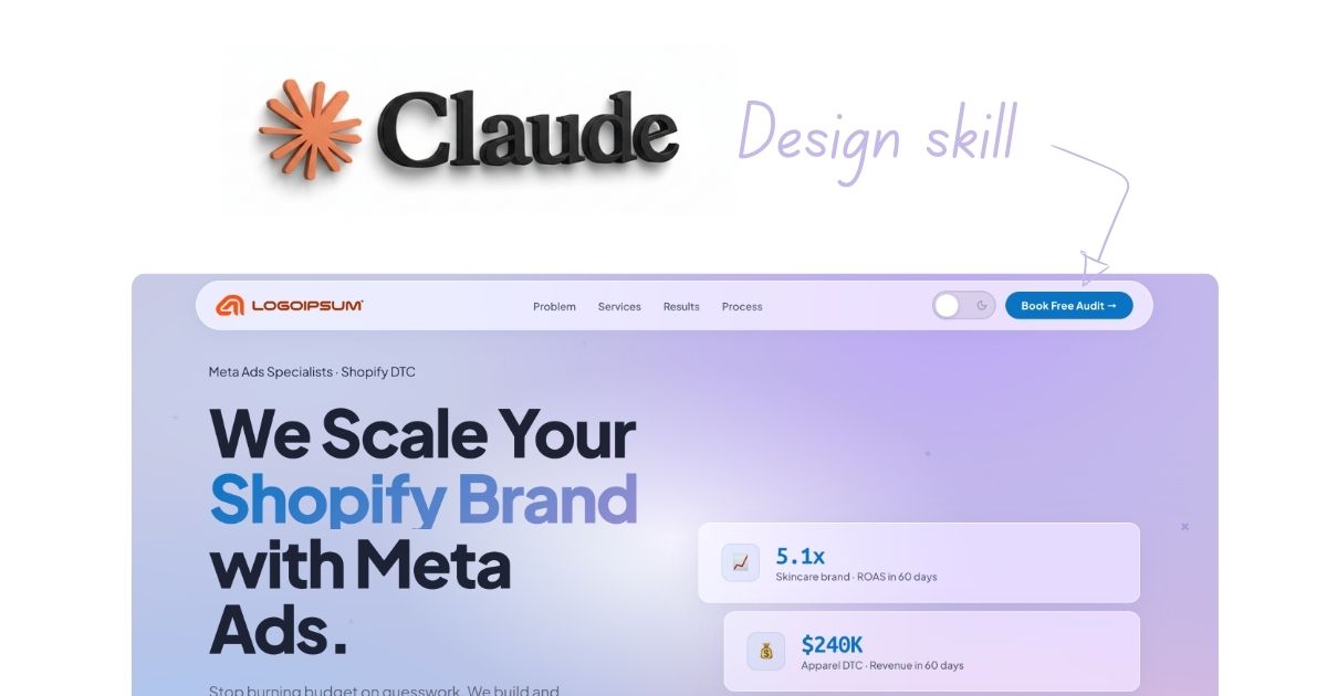
 How to use Claude Code to build Apps
  10 Best Claude Code Skills for beginners
  How to create AI Video Animations with Claude + Remotion
  How to use Claude Code to build a Website
  How to use Claude Skills for beginners
  How to write the PERFECT CLAUDE.md file
  Automate 80% of your Marketing with Claude
  How to use Claude Code — The basics
  Work 2X Faster with Claude Cowork
  How to NEVER Hit Claude Usage Limits Again